
Email designs
Good email design will achieve more than a recipient’s attention, but a possible website visit and even purchase if done right. Using the right words and phrases is critical in marketing, but how that message is communicated is equally important and can affect the participation of your subscribers. According to Statista, it was reported that there were 3.9 billion email users in 2019 and the number is expected to reach 4.3 billion by 2023. The statistics for the number of emails sent per day reaches an upwards of 300 billion! Surprisingly, email marketing continues to be a strong asset to emerging and existing businesses and it takes a bit more effort to make an email stand out these days.

What is email design?
Not all email designs are the same
Depending on the kind of information you want and need to share with your email list, the design will change. For example, a welcome email and order confirmation email are two different things. The content changes the context, which means you as the designer will have to find an appropriate way to convey whatever message you are trying to communicate with the reader. Think about what reaction you want to prompt when people view your email and this will allow you to have fun with the elements you incorporate! These designs should always stay consistent with your business’ branding so always assure that you’re not straying away from your brand’s aesthetics.
One of the first steps to take during the design process is to establish the topic, theme and goal of the email. This is what email marketing is all about: conveying a message that you hope your subscribers will understand and engage in.. Mundane and repetitive email designs are most likely not going to get many responses. A streamlined process of putting together colours, text and imagery that lets your brand’s personality shine through is much more successful in drawing in your viewers.


Here’s what you should always include in email design
Brand logo
A strong colour palette
Short and sweet text
Hidden clickable links
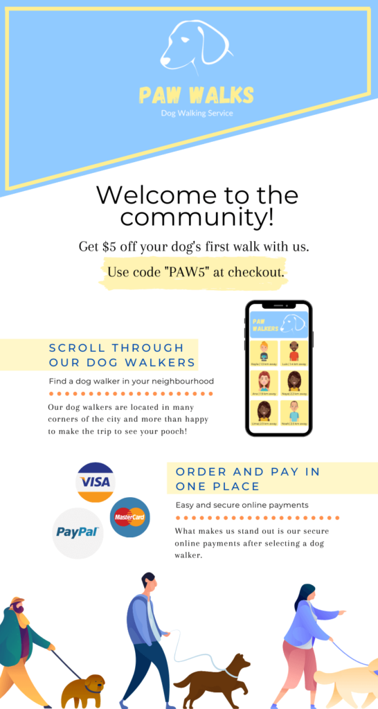

Here is an example of a branding guideline for the email design example. Within these parameters, there are many different ways to make an eye catching email. You can also be creative with the kinds of imagery you include such as the dog walkers at the bottom of the email. Because the rest of the email is fairly simple, the colours provided on the figures complement the rest of the email.
Conclusion:
Email marketing is used more than ever these days. If you want your brand’s emails to stand out amongst the others, make it different. Keep the user’s experience in mind when designing so it’s easy to use for anyone. If you include any animations or videos, send a test-run so you can be sure that the clips are responsive and don’t lag. Refer back to this post for reassurance of whether or not your business is on the right track to creating an eye-catching email!
Is Your Website In Need Of A Make-Over?

COMPANY

SERVICES
EXPERTISE
+1 (647) 349-2332
© 23e2 Business Services Inc. | Working With 3rd Parties
© 23e2 Business Services Inc. | Working With 3rd Parties