
Responsive Design
When using any website, it should be available to most platforms, like laptops, tablets or smartphones. People use everything not just one thing nowadays. User Experience Designer got to make sure that the website they put it for all platforms
What is Responsive Design?
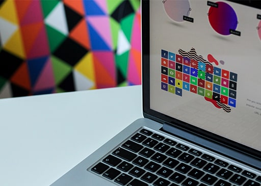
Responsive Design is a way of web design to render pages on different devices and different screen sizes or window sizes. Viewing the content is a part of this. Also, a big part of Responsive Design is images, design and performance. This is for all devices to make all of the devices are usable and people are happy when they use it.
A website used by Responsive Design has to implement a layout that has grids that are proportioned and fluid. It cannot be pixels or points. When designing, HTML and CSS is involved, but when using CSS, media queries are needed to be used for it. This is because it is an extension of the media rule.
It is an extension in a way because:
- When using the fluid grid, it shows that there is a page element sizing. It uses percentages instead of absolute units like points and pixels
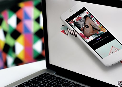
- Images that are flexible can be in different sizes in applicable units, so they don’t show outside the page The media queries allow its page to use different CSS rules depending on the device it is going to be implemented on
- With the responsive layout, it changes automatically depending on the device and size of the screen.
The Challenges of Responsive Design
When it comes to design, there can be a lot of challenges that user experience designers face. It can be on mobile or the web. One of the changes is banner ads and video is fluid or not running smoothly on different devices. Also, with search ads and display of the banner, it can only support specific devices and different format sizes of the banner for the desktop, and mobile devices.
Another challenge is using RESS (responsive web design with server-side components). This can help make a good user experience with better optimization for mobile devices. RESS is expensive to use, and it requires more than client-side thinking. Only organizations that large budgets can use it.
Responsive Design is what allows all devices to view websites anytime and anytime without any issues. Without this, businesses won’t gain any profit because more people means more money.
Is Your Website In Need Of A Make-Over?

COMPANY

SERVICES
EXPERTISE
+1 (647) 349-2332
© 23e2 Business Services Inc. | Working With 3rd Parties
© 23e2 Business Services Inc. | Working With 3rd Parties